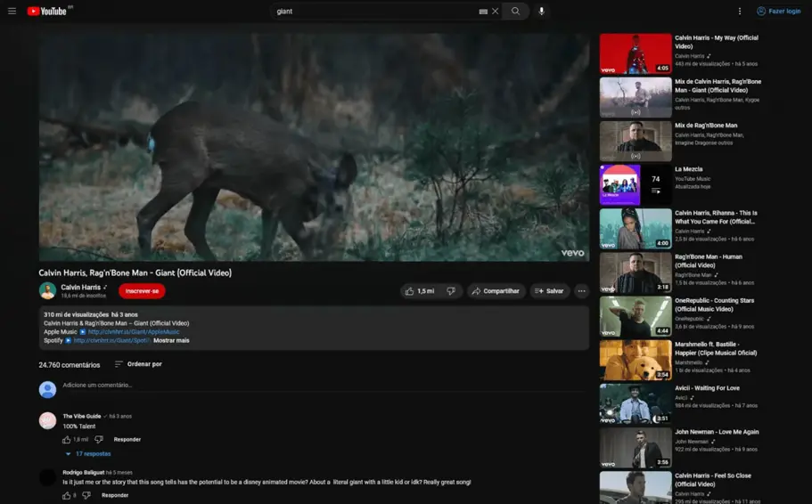
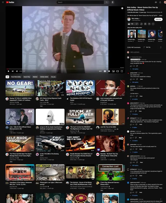
One of the key changes is that the description and comments are now to the right of the video, rather than below it.
Some YouTube users noticed the new design of the video viewing page in the browser version of the popular service. Now it has become more like Twitch.
One of the key changes was the relocation of the video description and commentary to the right side of the screen. The vacated space now contains an endless block of recommendations with large previews.
Users have already appreciated the updated design and called it one of the most unsuccessful, and many are asking to return everything as it was. With these changes, Google clearly wants to keep users on the site for as long as possible – so that they immediately turn on the next video.
As it was

How did it happen?

You cannot switch to the new design on your own: it appears randomly for users from different countries. This design was first presented back in May 2023, but now, apparently, it has been approved and will be working for everyone in the near future.
Since the beginning of 2024, many YouTube users began to complain about the brakes and slow performance of the web version of the site. This is especially noticeable when switching to full-screen mode. As it turns out, it’s all about ad blockers, in particular AdBlock. When it works, videos take noticeably longer to load, even if the Internet is stable
Back in October 2023, the YouTube service (a division of Google) declared war on ad blockers, since advertising provides almost 80% of the service’s income. It is likely that it will soon become increasingly difficult to watch any content without advertising.


